An educational tool for marking multimedia assessments
About the Project
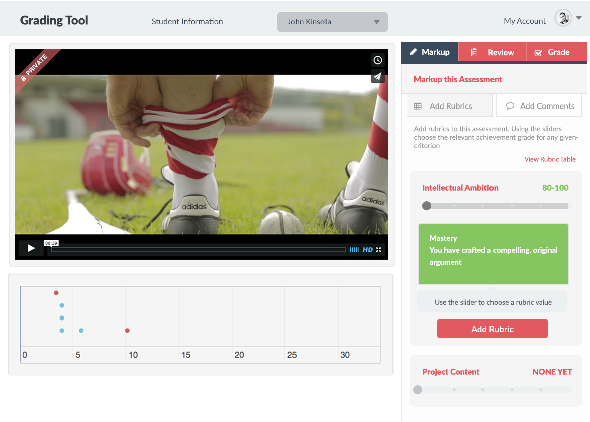
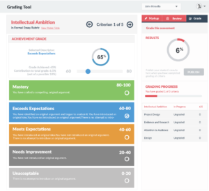
The aim of Red Ink was to create a web-based tool providing the ability to grade, provide rapid feedback and comment on multimedia based assessments such as video and audio. The assessment processes were based on use of Rubric tables (a scoring tool that lists criteria for a piece of work and expresses grades of quality for each criterion). Management of this aspect was a key component of the project. The tool allowed for management of student groups, as well as creation, update and management of rubric tables. The ability to configure an assessment and assign a rubric to it as well as management of the assessment via a ‘grade book’. The core of the app was a Grading Tool where direct feedback could be added to a video or audio piece at an exact point on the timeline, and feedback could be chosen from a library of comments or added as free-text. In the tool, the final grade could be set by marking each criteria in the rubric table within a range. Then the final, marked assessment could be previewed and published for the student to view. The tool was designed for use on desktop or tablet for ease of instructor use. It was designed based on a hosted JSP backend with JSP directly powering many of the CrUD pages. The core Grading Tool app was created in AngularJS to power the many dynamic tasks required therein, and it communicated with the JSP server over JSON.
My Role
I joined the team in the last phase of the project once it had been scoped and architected, and after work had begun on programming and interface creation. The multi-disciplinary team were wireframing and then creating native html interface pages, then passing them to JSP developers and then back to the interface team for refinement. Much was being lost in translation and the front-end was inconsistent with variations in styles of elements and pages. My initial role was to advise how to streamline and bring cohesion to the front-end of the app. On my advice, Bootstrap 3 was chosen as a front-end framework which provided a baseline from which everyone on the team could work and it brought the badly need cohesion. The previously created pages were ported to Bootstrap and the development team found it much easier to pass pages back and forth. I provided troubleshooting for problems which arose in the front-end using Bootstrap and reviewed the front-end interfaces once they were created and integrated.
The second part of my role was to create the Grading Tool interface using Bootstrap 3 and Angular JS (v1.5), communicating with the server using JSON. This approach was successful and all of the features set out in our development plan were achieved, including the ability to add comments or grade-points to video at any point on a timeline and have this visually represented on the timeline while the video or audio played. Several plugins were used to achieve this functionality, whereby I sourced and integrated them into the app.
Processes
In the first phase, I consulted on how to streamline the project workflows and deliverables, advising on the move to a front-end framework. I ran a training workshop to help the interface developers move to Bootstrap and did troubleshooting and bug-fixing when issues arose.
In the second phase, I concentrated on user flows and processes to bring all the screens together in good working order. I then moved on to building the Grading Tool using HTML, CSS and Angular JS on the Bootstrap base and using some JQuery plugins for extra features. I worked with the JSP developers to ensure the JSON communication with the server worked effectively and helped iron out issues.
Lastly, I created tablet mockups and reported on how the system could be used for documents in a later phase.


